Client
Complori
Industry
EdTech
Category
Web App
Role
Product designer
Location
Berlin, DE
Timeline
2024
This case study is about real-time state communication — what happens when a critical product moment depends on users knowing what's happening, and the system stays silent.
Complori, an EdTech platform providing live programming courses for kids. The live class is the core value users pay for — and live through twice a week. Anything that breaks at that moment puts retention at risk.
Web App
Live, Coach-led
Gamified
Zoom-style class
Small groups
Audience
Parents, primary decision-makers
Kids aged 7–15, daily active users

DISCOVERY & RESEARCH
I started this project with an observational review, experiencing the product the way a new user would. Three issues quickly emerged: no visibility into real-time class status, low discoverability of the class entry point due to its low visual priority and non-intuitive placement, and fragmented information architecture.

To validate my initial observations, I went to four data sources. Together with my PM, we triangulated signals across them — to separate isolated issues from systemic patterns. I'll highlight only the most relevant insights.

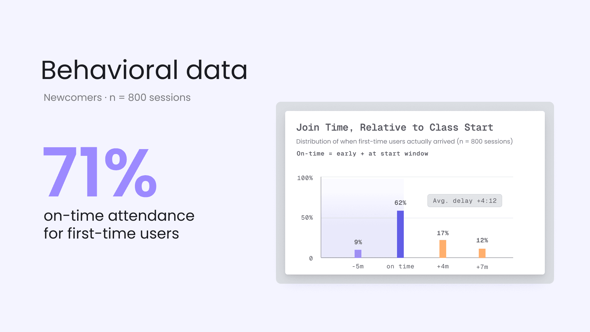
Users guess when class starts
→ late attendance
Parents panic during incidents
→ support overload
Operations compensate manually
→ doesn't scale

IDEATION
To make the entry point more visible, I had the idea to move the main action into the user’s natural flow of attention. Instead of placing it in the side navigation — where it can easily stay in the periphery — the goal was to make sure newcomers never miss their first class. I explored several alternative core action placements. Each option has its own pros, risks, and trade-offs.
"Hero"
Banner

Contextual Card Replacement


DESIGN EVOLUTION
An iterative approach allowed me to move from quick improvements to more informed decisions. I started with quick visibility improvements—enhancing contrast and making the Entry Point more prominent. This was a fast, low-effort way to improve discoverability. Next, I introduced a dynamic status indicator—a countdown timer that updated the button state in real time. To reinforce urgency, the timer changed color when users were late.

While this iteration improved on-time attendance and reduced support inquiries, it still lacked sufficient visibility. Building on these insights, I prioritized solutions based on their impact on on-time attendance and implementation complexity. Two concepts emerged as the strongest candidates. We validated this direction through an A/B test.
A/B TESTING & VALIDATION
Experiment Overview: To identify the most effective placement for the entry point, we conducted a 14-day A/B test with a segment of newcomers. The goal was to find the right balance between maximum visibility and interface clarity.

Variant A:
Global Sticky Footer
Hypothesis: A persistently visible panel at the bottom of the screen maximizes reach, as the entry point remains in view during scrolling and stays accessible across all pages of the learning platform.

Variant B:
Contextual Sidebar Widget
Hypothesis: Placing a prominent widget within the “utility zone” would associate the entry point with schedule-related information, creating a stronger and more logical context for interaction.
Context beat pure visibility
We tested two variations, and the difference went beyond placement. The sidebar countdown widget increased visual prominence and introduced clear status indicators—icons and color states—that made the experience instantly understandable. Users could immediately recognize whether a class was upcoming or live. Paired with its contextual placement near the schedule, this reduced cognitive load and improved performance across all key metrics.

FINAL SOLUTION
Once we validated the concept through A/B testing, I translated it into a final, production-ready component. We evolved the static ‘Join’ button into a dynamic, state-driven component.

Waiting

Phase 1: Initial Implementation
Live

Phase 2: Operational Extensions
Notification
Previously, class-related actions were scattered across the interface, making it harder for users to locate the correct entry point. The redesign introduced a unified class overview, where the dynamic widget became the primary interaction point—bringing visibility, timing, and status into one place.

NOTIFICATION CONTROL CENTER


A beautiful UI is useless without effective management. Previously, notifications about lesson schedule changes could take up to 15 minutes, which is not ideal for real-time communication. To make the widget work in real time, we needed to give superpowers to operations and support.
Problem
Ops and CS had no direct way to communicate with students inside the platform. They had to use manual email/SMS/calls, which was slow and led to a "information lag".
Goal
Transform manual support tasks into a scalable, efficient communication system, where Admin and Ops actions are instantly reflected in the student UI to maintain trust during incidents
The Notification Control Center is designed for high-pressure situations—when a Coach doesn’t show up, or class is delayed or some temporary tech issue. In these moments, speed and accuracy are critical. I prioritize clarity, efficiency, and scalability, enabling teams to act quickly and without error.

This is another part of the interface designed to manage all published notifications and drafts in one place. It allows admins to efficiently view, search, and manage communication across the full lifecycle.

IMPACT & RESULTS
36%
KEY INSIGHTS
Visibility alone doesn’t drive action. Users act when information is both visible and meaningful in context.
Real-time UX requires system thinking. A seamless interface depends on operational tools and data flow behind the scenes.
Clarity reduces cognitive load and builds trust. Clear status communication helps users make faster decisions and reduces anxiety.
This project was created as part of my work at Complori, an EdTech company. The presented material is a demonstration of my contribution to concept development and is not intended for commercial use. All rights belong to their respective owners.


© Oleksandra Zuieva, 2024-2025